
Rebuilding trust in automated financial guidance by uncovering why 99.8% of eligible users didn't engage with the robo advisor
Role
Product Strategy, User Research, Service Design, Stakeholders Interviews, Workshop Facilitation, Prototyping, Usability Testing, Design System
Client & Sector
Natixis
Banking
Team
1 Lead Product Designer (my role)
1 Product Manager, Engineering Team, Legal & Compliance Stakeholders
Duration
7 Months
Overview
The Context
Natixis Wealth Management launched a robo-advisor to help customers optimise and diversify their professional savings plans. Despite significant investment, adoption remained critically low. The robo advisor, initially implemented as a Proof of Value to match competitors, was being utilised by only 0.2% of eligible savers. This was a clear signal that the product wasn't meeting users' actual needs. My role was to understand why and transform the service into something genuinely valuable for everyday savers managing their professional savings accounts.
2/3
French people felt they lacked adequate knowledge about savings and investment products
0,2%
Eligible savers utilised Natixis' robo advisor
66%
French people believed stock market investing was reserved for expert only
The Challenge
This project presented a design challenge specific to the banking environment: addressing a critical adoption problem by building trust in a low-trust environment while navigating complex regulatory constraints.
Approach & solutions:
Reframing The Challenge
A key shift emerged from aligning the business vision.
The robo-advisor had originally been introduced to achieve competitive parity within the wealth management market. However, adoption stalled almost immediately. I led a discovery-to-delivery initiative to identify the root causes of adoption failure and redesign the experience around explainability, transparency, education, and user control. To align stakeholders around the problem space, I facilitated workshops with product, business, operational, and compliance teams.
Business Challenge:
- Adoption rate: 0.2%
- Low engagement throughout onboarding
- Limited trust in automated financial guidance
- High abandonment before recommendations were generated
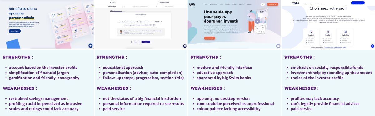
Through competitors analysis, I observed that:
- Direct competitors favoured simple wording, personalisation, and comprehensive coverage of investment options.
- Indirect competitors excelled at innovative, pedagogical approaches and socially-responsible investment narratives.
- We needed to find our own voice in this landscape while addressing a fundamental challenge: users' lack of trust in financial services.
The Business Vision
The robo advisor should be an optional, non-intrusive, and educational service to help diversify savings.
Approach & solutions:
Mapping The System
The adoption problem emerged from multiple systems interacting simultaneously:
Structural Barriers
- Savings accounts were often created by employers rather than users
- Users had limited engagement with their financial products
- Financial literacy levels varied significantly
Trust Barriers
- Limited confidence in financial institutions
- Uncertainty about how recommendations were generated
- Concerns around personal data usage
Regulatory Barriers
- Mandatory disclosures increased friction
- Financial terminology created cognitive overload
- Compliance requirements constrained simplification efforts
(Images are subject to NDA and are available upon request.)
Approach & solutions:
Exploring Financial Decisions Approach
Trust Was The Strongest Adoption Barrier.
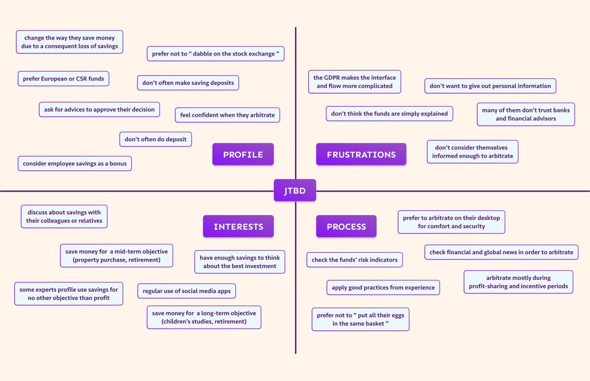
Instead of evaluating reactions to the robo-advisor itself, I explored how people approached financial decisions more broadly through JTBD interviews. This revealed three major insights. Users wanted transparency into:
- Why data was being collected
- How recommendations were generated
- Who was responsible for the advice
Loss Aversion Dominated Decision-Making.
Users were significantly more motivated by avoiding mistakes than maximising gains. Previous negative experiences shaped future investment behaviour.
Nobody Identified As The Intended User.
Beginners felt intimidated. Experienced investors felt the service provided little value. The experience failed to create a compelling reason to engage for either audience.
Approach & solutions:
From A Usability Into A Trust Challenge
Helping users understand financial recommendations before asking them to trust them.
This product vision became the foundation for the project. While the initial assumption was that usability issues were preventing adoption, I discovered that users weren't rejecting the interface. They were rejecting the idea of receiving financial advice from a system they didn't understand or trust.
The Problems
How might we make users feel personally concerned by the coaching service?
How might we provide basic information that users need in order to feel autonomous while saving for a project?
How might we reassure users about the value exchange of sharing personal information for personalised financial advices?
Approach & solutions:
Design Principles Behind The Redesign
Design Principle 1: Explain Why Information Is Needed
Research showed users hesitated to share personal information because they did not understand its purpose. To address this, I introduced contextual explanations throughout onboarding. Each question answered:
- Why the information was required
- How it influenced recommendations
- How user data would be used
This reduced uncertainty and improved perceived transparency.
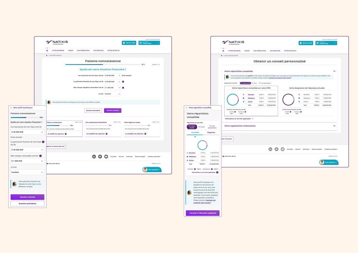
Design Principle 2: Reveal Recommendation Logic
Users wanted to understand the connection between:
- Investor profile
- Financial goals
- Risk tolerance
- Recommended actions
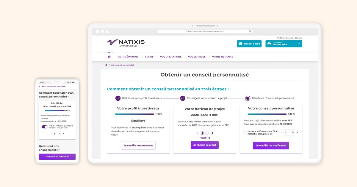
To support this mental model, I redesigned recommendation screens to expose key recommendation drivers rather than presenting outputs without context. Instead of: "Here's your recommendation." The experience communicated: "Here's why this recommendation was generated." This transformed recommendations from system outputs into understandable decisions.
(Images are subject to NDA and are available upon request.)
Design Principle 3: Preserve User Agency
Research showed users resisted experiences that appeared to make decisions on their behalf. To address this, recommendations were positioned as guidance rather than instructions. The robo-advisor became:
- Educational
- Assistive
- Optional
rather than authoritative. This reduced perceived risk while increasing user control.
(Images are subject to NDA and are available upon request.)
Approach & solutions:
Cross-Functional Leadership Under Regulatory Constraints
Because trust, regulation, implementation, and business objectives were deeply interconnected, success depended on close collaboration across disciplines. I partnered with:
- Product Management to prioritise opportunities and define success metrics
- Engineering to align designs with technical constraints and implementation realities
- Compliance and Legal teams to ensure regulatory accuracy
- Business stakeholders to maintain alignment throughout delivery
Using Round Robin and 6-to-1 ideation exercises, we explored alternative approaches to presenting mandatory content while preserving legal accuracy. This resulted in:
- Simplified content structures
- Improved disclosure hierarchy
- Reduced cognitive load
- Greater contextual understanding
Approach & solutions:
Key Findings From Usability Testing
Recommendation Context Improved Confidence
Participants responded positively when recommendation logic was explained before outcomes were presented.
Third-Party & Wrong Tone Remained A Trust Concern
Participants wanted greater transparency regarding the robo advisor provide. They perceived certain questions as "not serious" or "off topic".
Financial Terminology Increased Cognitive Load
Specialised language reduced confidence and increased hesitation, across onboarding, content hierarchy, and recommendation presentation.
Investor Profiles Created Stronger Mental Models
Users better understood recommendations when starting with their investor profile rather than future financial goals.
Approach & solutions:
Scaling The Solution Through Design Systems
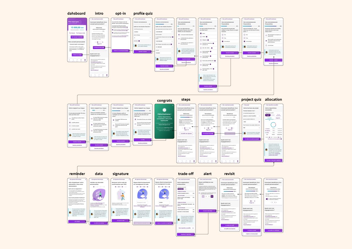
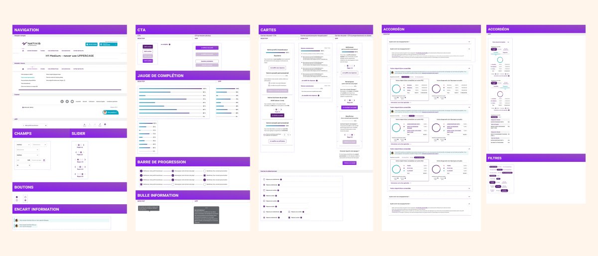
The redesign introduced new patterns for transparency, recommendation explainability, and contextual education. To support future initiatives, I incorporated these patterns into the design system during the team's migration from Sketch to Figma. This included:
- Reusable onboarding patterns
- Educational content components
- Accessibility improvements
- Documentation for design and engineering teams
- Shared implementation guidelines
This allowed the work to scale beyond a single product experience.
Results
Robo Advisor Redesign Outcomes
Product Outcomes:
- Increase in onboarding completion
- Increase in recommendation engagement
- Improvement in recommendation comprehension
- Improvement in trust perception
- Reduction in support inquiries
Organisational Outcomes:
- Established a new strategic direction for assisted financial guidance
- Created reusable explainability patterns for future recommendation products
- Improved alignment between product, compliance, and engineering teams
Users do not need to understand every technical detail behind a recommendation system. They need enough transparency to understand:
- Why a recommendation exists
- How it relates to their situation
- What level of control they retain
The most impactful shift was moving the experience away from algorithmic authority and toward explainable decision support.
2/3
French people felt they lacked adequate knowledge about savings and investment products
0,2%
Eligible savers utilised Natixis' robo advisor
66%
French people believed stock market investing was reserved for expert only