
Transforming digital banking experience through inclusive AI-powered chatbot for 1M+ customers
Role
AI Product Lifecycle, Product Strategy, User Experience Design, Design System, Accessibility Leadership, iOS/Android App, Responsive Web Design, Prototyping, Cross-Functional Facilitation
Client & Sector
Hello Bank/BNP Paribas
Banking
Team
1 Lead Product Designer (my role)
3 UX/UI Designers, 1 UI Designer, 1 Design System Master, 4 Product Managers, 1 Head of Design
Duration
8 Months
OVERVIEW
The Context
Hello Bank runs entirely on its digital experience. When that experience started cracking under the weight of new features, an overloaded support team, and a chatbot nobody trusted, the work became less about adding things and more about fixing the foundation. I led two connected initiatives across mobile and web:
- Relaunching an AI-assisted customer support system
- Redesigning the banking homepage experience
The work extended beyond interface redesigns. It required aligning product, engineering, legal, compliance, and support teams around a more responsible and scalable approach to AI, accessibility, and customer trust in a regulated environment.
67%
Response time reduction, from 20 seconds to 6 seconds
📉
Lower escalations due to clearer fallback paths
1M+
Customers across all platforms, 250K+ for the POV's base
The Challenges
Hello Bank’s platform had been designed for one job: let people check their balance fast. That worked fine for a while. Then new features were layered on top, navigation got deeper, and nobody went back to rethink the structure. By the time research started, users were missing whole categories of what they could do with their own money. As the product ecosystem expanded, the experience became increasingly fragmented.
The first chatbot had made things worse. It created more friction than value. Response times hit 20 seconds on average, answers were inconsistent. If your question didn't fit a supported category, nothing happened. Meanwhile, support teams were fielding the same repetitive requests over and over. Compliance raised flags about financial guidance. And internally, people had lost confidence in the whole AI effort.
first challenge:
The Chatbot Nobody Trusted
Reframing the brief strategically.
The original brief was to build a sophisticated conversational assistant that could handle a wide range of financial queries autonomously through generative AI. However, user feedbacks and technical discovery pushed back on that pretty quickly:
- Hallucination risk was too high for sensitive financial interactions
- Long response times damaged perceived reliability
- Ambiguous AI behaviour reduced trust quickly
- Unsupported requests lacked clear escalation paths
- AI capabilities were overestimated internally
- Users valued clarity and predictability more than conversational sophistication.
Rather than positioning AI as a replacement for human support, I reframed the experience around:
- Rapid information retrieval
- Task-oriented guidance
- Deterministic support flows
- Escalation assistance
- Transparent system limitations
The pivot from "autonomous assistant" to "confidence-aware guide" came from understanding that the design problem wasn't capability, it was transparency. This shifted the product strategy entirely, becoming a critical alignment point between product, engineering, and compliance teams.
(Images are subject to NDA and are available upon request.)
The Problem
How might we introduce AI-assisted experiences responsibly while improving usability, trust, and operational efficiency at scale?
approach & solutions:
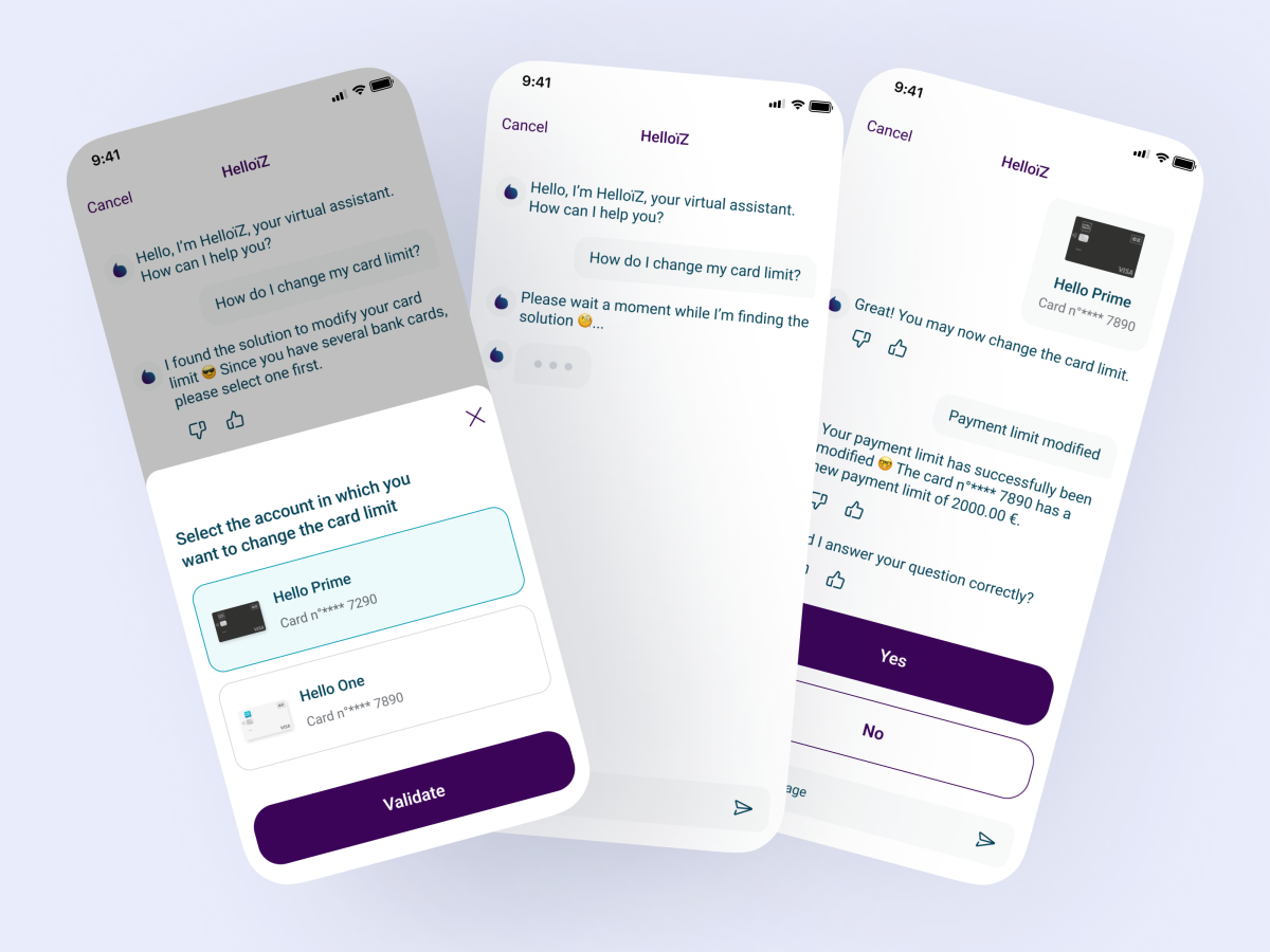
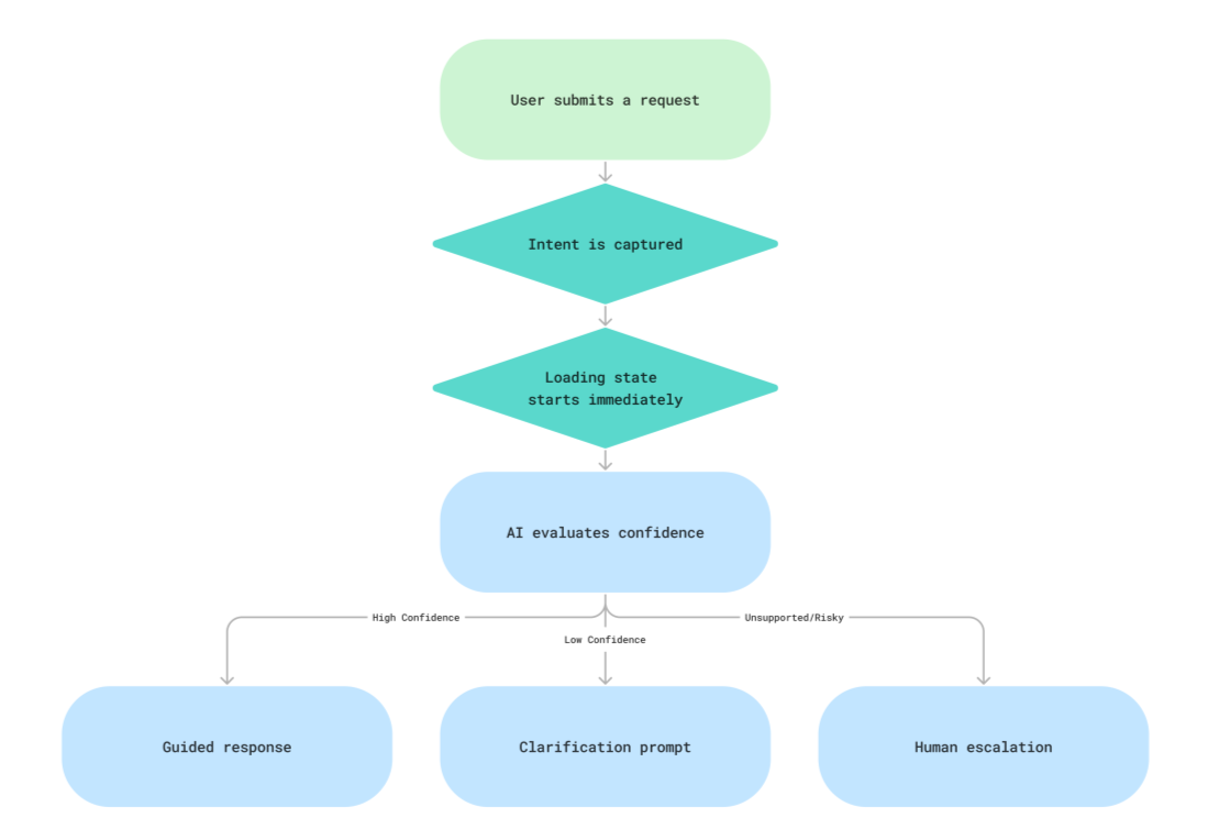
AI Confidence Routing
Three paths structured around what the AI was certain about.
Instead of designing a purely conversational assistant, I worked with engineering teams to structure the experience around confidence-aware interaction patterns. This reduced ambiguity while improving trust calibration during sensitive interactions.
approach & solutions:
Designing For Edge Cases
Most AI chat design shows the happy path. Here are 4 states that actually defined trust.
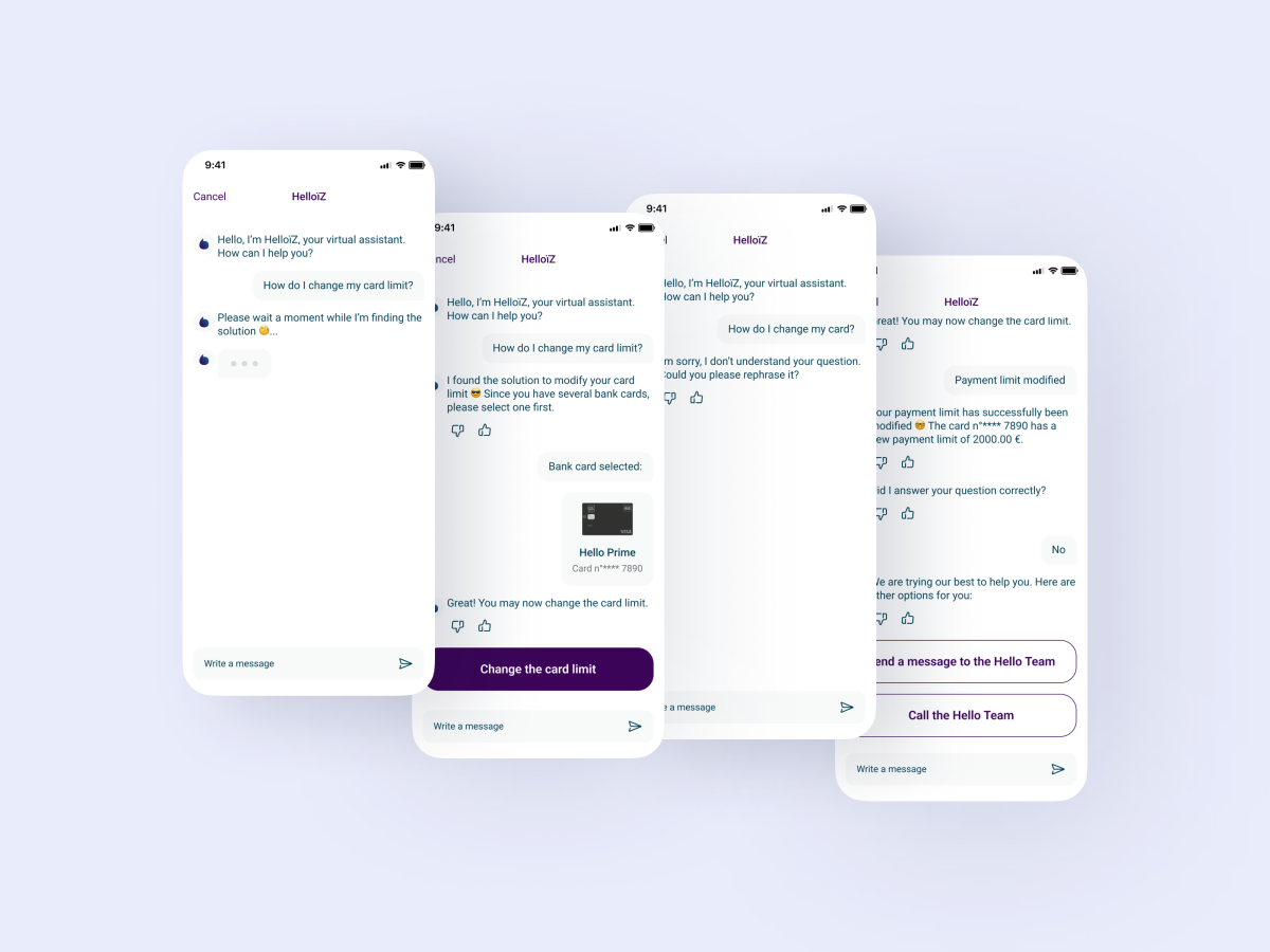
Loading
Progressive reveal with expectation-setting copy. Users knew something was happening and roughly how long it would take.
Guidance
Deterministic response with clear next action. No open-ended "does that help?" dead ends.
Clarity
Specific follow-up question, not a generic "can you rephrase that." The system had to earn the retry.
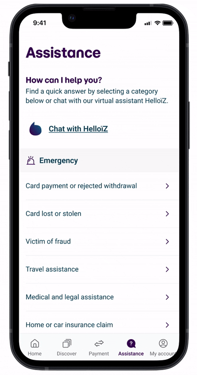
Support
Escalation to an actual human if the chatbot didn't provide a satisfying answer. The customer can choose to send a message or call an agent.
aproach & solutions:
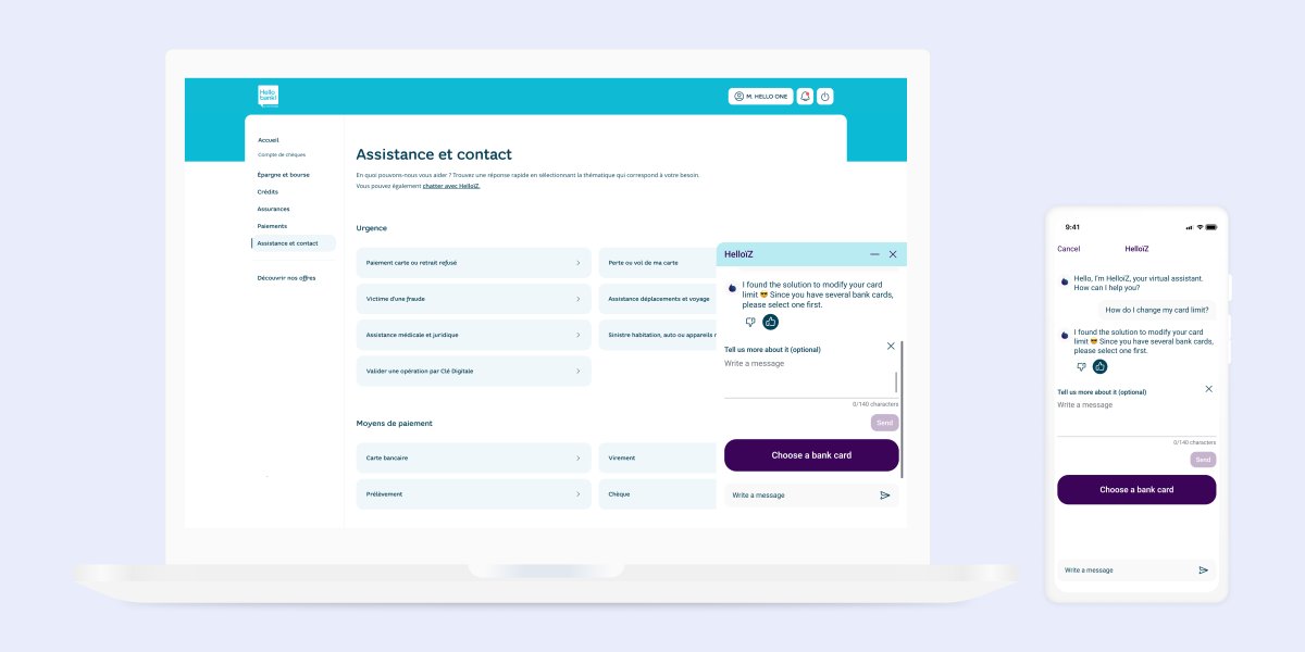
Conversational Design That Brings Confidence
Navigating between ongoing improvements and outdated branding.
I crafted language that would build trust through thoughtful UX writing. I chose to build the chatbot character's identity by defining its persona, its tone of voice.

aproach & solutions:
Reducing Perceived Latency
Redesigning the waiting experience before the back end caught up.
Backend optimisation takes time to ship, so I redesigned the waiting experience itself. Improvements included contextual status indicators, lightweight motion feedback, and microcopy that set expectations instead of asking users to just wait.
The problem wasn't the time, it was the uncertainty. People can wait 20 seconds for a complex request if they believe something useful is happening. These changes reduced user uncertainty during long-running requests and significantly improved perceived responsiveness.
RESULTS
AI Support Outcomes
The redesign of support experience led to:
→ Response time dropped from 20 to 6 seconds — measured across usability session before backend changes shipped
→ Escalation clarity improved — unsupported requests now had a named path rather than a dead end ex. ticket volume reduction target: ~30% unconfirmed
→ Stakeholder confidence in AI-assisted workflows rebuilt — compliance and legal signed off on the revised interaction model
→ Conversational patterns became reusable across additional support flows
→ Earlier accessibility integration within delivery workflows
Most importantly, the initiative shifted organizational thinking from: “How do we automate support?” to: “How do we responsibly augment customer assistance?
-32%
Escalations to human agents after chatbot redesign
-40%
Time-on-task for premium products discoverability
-37%
Design-to-dev handoff time
second challenge:
An Outdated Homepage
What research has revealed.
The homepage experience had been designed primarily for quick account checks, but platform capabilities had expanded significantly over time. As new services were added, the information architecture became increasingly difficult to navigate:
- Important features lacked discoverability
- Advanced actions required excessive navigation depth
- Cross-platform inconsistencies increased cognitive load
- Users struggled to prioritise financial information
- Homepage density reduced task clarity
At the same time, the interface needed to support very different behaviours:
- Frequent daily banking tasks
- Occasional high-stakes financial actions
- Both digitally confident and less technical users
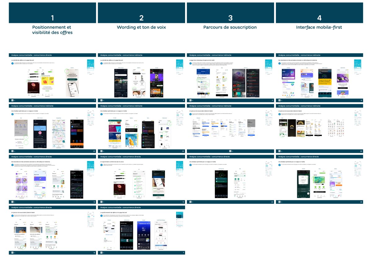
Four inputs shaped the decisions: competitor benchmarking, behavioural synthesis from support tickets and app store reviews, accessibility audit, and stakeholder workshops.
(Images are subject to NDA and are available upon request.)
approach & solutions:
UX Strategy & Organisational Influence
From a visual execution workflow to a collaborative, research-driven practice.
I introduced more collaborative and research-driven product practices, including:
- Kick-off interviews
- Workshop-based discovery
- Cross-functional ideation sessions
- Collaborative prioritisation exercises
- Data-informed decision frameworks
- HMW facilitation workshops
These practices improved alignment between teams and reduced downstream design debates during implementation.
The Problems
How might we design a homepage that serves both day-to-day tasks and occasional complex transaction?
How might we maintain cross-platform consistency in the homepage experience while leveraging each platform's unique strength?
How might we provide the right information at the right time while keeping everything else easily discoverable?
approach & solutions:
Navigation Hierarchy Evolution
Designing for progressive disclosure.
Business stakeholders initially pushed to add more products and services to the homepage under the principle that visibility drives adoption. That's not wrong. The conflict came from usability data showing that more density was reducing task completion. The negotiation was about reframing what "visibility" actually meant: a feature buried under cognitive load isn't visible.
Before
- Dense homepage, everything surfaced at once
- No priority hierarchy between actions
- Complex features 3–4 taps deep
- Inconsistent patterns across iOS and web
- Cognitive overload on first view
After
- High-frequency actions surfaced first
- Secondary content contextualised, not hidden
- Reduced navigation depth for complex tasks
- Shared interaction patterns across platforms
- Progressive disclosure by task type
approach & solutions:
Design Operations For Scalable Systems
Consistency and implementation scalability as major operational concerns.
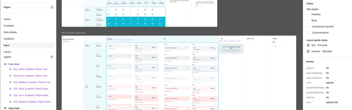
As the redesign expanded across platforms, I partnered closely with the design system lead to:
- Standardise responsive behaviours
- Evolve reusable navigation patterns
- Improve accessibility documentation
- Align interaction behaviors across platforms
- Reduce implementation inconsistencies between web and mobile
Rather than designing isolated screens, I focused on scalable interaction systems engineering teams could reuse efficiently.
approach & solutions:
Accessibility-First Design Culture
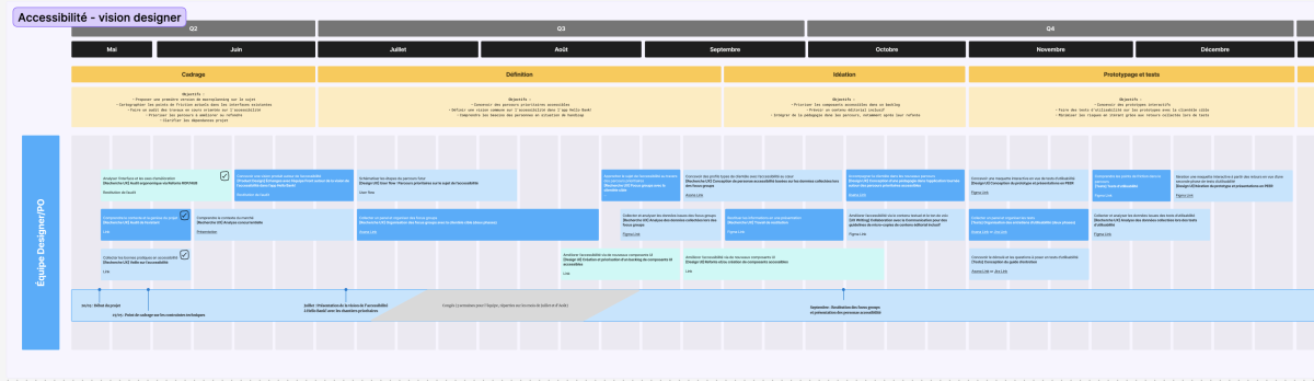
I led a shift toward accessibility and inclusivity as core design values rather than afterthoughts.
Focus Areas
- Screen reader support
- Keyboard navigation
- Responsive scaling
- Reduced cognitive load
- Voice interaction compatibility
- WCAG 2.1 compliance
I partnered with engineering and the accessibility referent to document reusable accessibility behaviours directly within the component library. This reduced implementation ambiguity and improved cross-platform consistency.
RESULTS
Homepage Redesign Outcomes
The redesigned homepage experience:
- Improved discoverability of complex banking actions
- Simplified high-frequency banking workflows
- Reduced navigation friction across platforms
- Established reusable cross-platform interaction patterns
- Increased accessibility consistency across components
- Expanded adoption of research-driven product workflows
Beyond the interface itself, the project helped mature how the organisation approached:
- AI integration
- Accessibility
- Product discovery
- Systems-based design
- Cross-functional collaboration
- Delivery processes at scale
By grounding decisions in user behaviour rather than AI capability assumptions, I created experiences that felt more reliable, scalable, and operationally sustainable.